Animated CSS gradient borders (no JavaScript, no hacks)
Learn how to create beautiful, CSS-only gradient borders. Combine custom properties, OKLCH, and background-origin — and zero hacks.
So much cool stuff has been happening in CSS lately — if you haven’t looked at it in a few years, it might be worth giving things another shot. A lot has changed!
Here’s what you’ll build by the end of this article.
See the Pen Gorgeous animated gradient borders using only CSS by Jason Lengstorf (@jlengstorf) on CodePen.
To follow along, create your own CodePen or open an HTML document where you can modify the HTML and CSS.
Set up the HTML markup
Because of the way these borders are set up, we don’t need any extra container elements. We can use straightforward semantic markup.
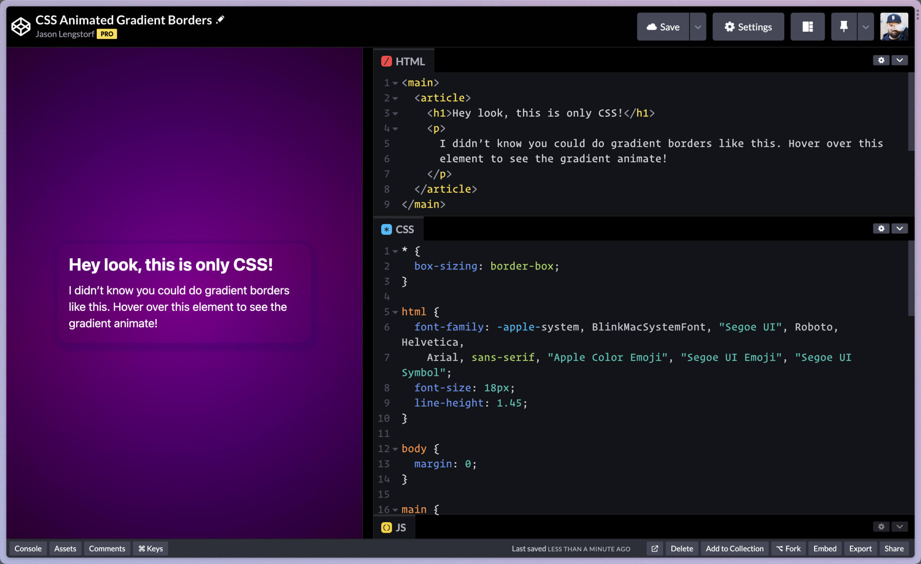
<main> <article> <h1>Hey look, this is only CSS!</h1> <p> I didn’t know you could do gradient borders like this. Hover over this element to see the gradient animate! </p> </article></main>The article will be the element that we style with the border.
Add base styles
This step is optional. To make our demo look a little nicer, let’s add some base styles:
- a basic reset
- background colors
- centering and spacing
- miscellaneous touches to make it feel nice
* {  box-sizing: border-box;}
html {  font-family: -apple-system, BlinkMacSystemFont, 'Segoe UI', Roboto, Helvetica,    Arial, sans-serif, 'Apple Color Emoji', 'Segoe UI Emoji', 'Segoe UI Symbol';  font-size: 18px;  line-height: 1.45;}
body {  margin: 0;}
main {  background: radial-gradient(      circle,      oklch(0.15 0.2 330 / 0),      oklch(0.15 0.2 330 / 1)    ), linear-gradient(344deg in oklch, oklch(0.3 0.37 310), oklch(0.35 0.37 330), oklch(0.3          0.37 310));  display: grid;  height: 100svh;  place-items: center;}
article {  border-radius: 1rem;  box-shadow: 0.125rem 0.25rem 0.25rem 0.5rem oklch(0.1 0.37 315 / 0.25);  color: white;  padding: 1rem;  width: min(400px, 90vw);
  & h1 {    line-height: 1.1;    margin: 0;  }
& p { margin: 0.75rem 0 0; }}Things won’t quite look right yet, but you’ll be looking much better than the default styles.
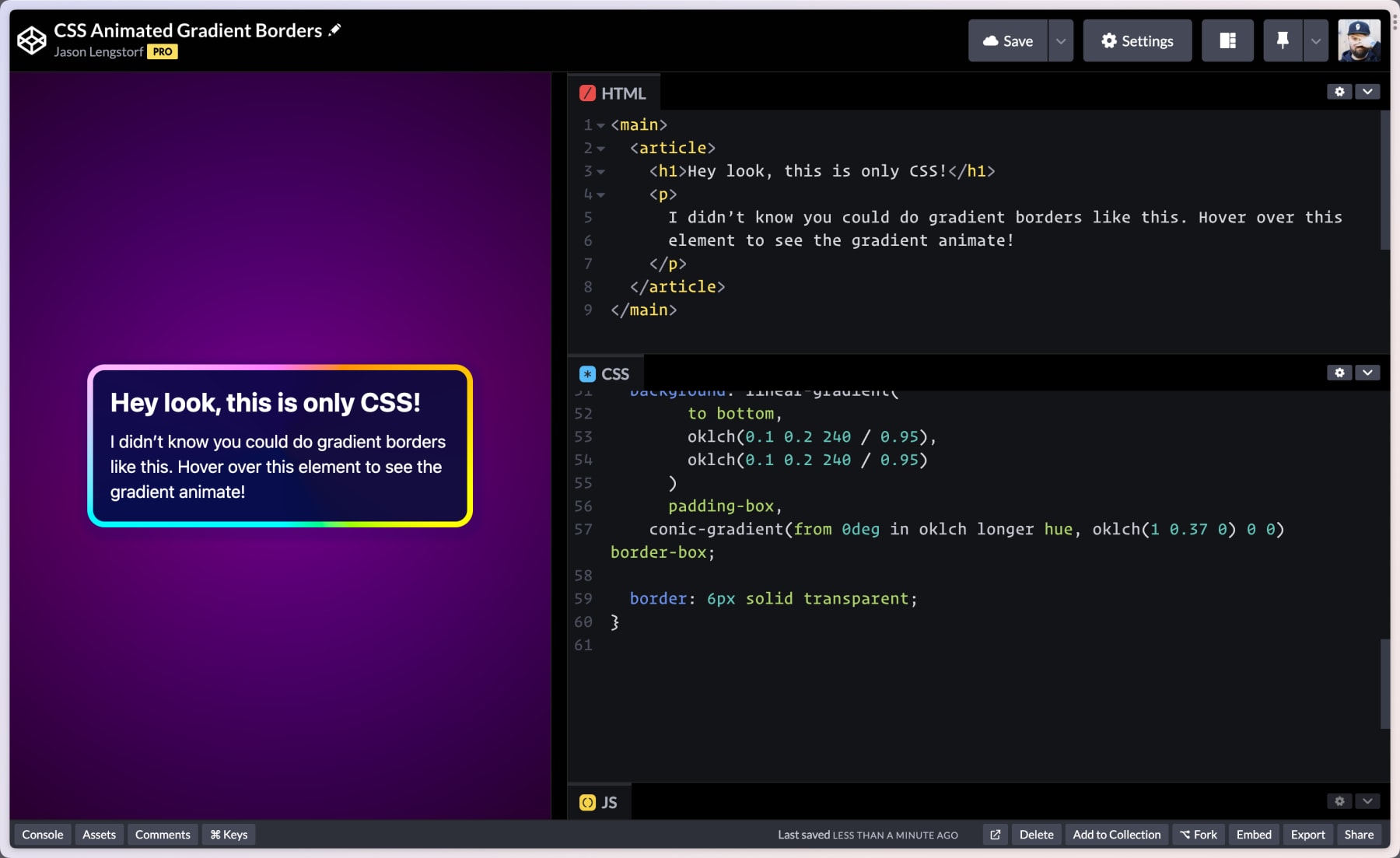
Create a gradient border using background-origin and conic-gradient()
To add the gradient border, we need to add two backgrounds to the article:
- one to be the solid, interior background (the dark color that makes the text visible)
- one to be the gradient border (a conical gradient)
To add these, add the following styles:
article {  background: linear-gradient(        to bottom,        oklch(0.1 0.2 240 / 0.95),        oklch(0.1 0.2 240 / 0.95)      ) padding-box, conic-gradient(        from 0deg in oklch longer hue,        oklch(1 0.37 0) 0 0      ) border-box;
  border: 6px solid transparent;}
After saving, the border will appear!
Let’s break down how this works.
Use multiple backgrounds
We add two backgrounds to our element:
The first background is the solid background inside the element that the text is placed on top of.
The second background is the gradient that will be used for the border.
Use background-origin to place the gradient in the border
A setting I’d never given much thought to before was background-origin. This tells the browser where the background should be contained (e.g. should it go to the border? the end of the padding? just the content area?).
By setting our first background to padding-box and the second to border-box, the gradient background extends further than the inner background, allowing it to become a “border”.
This means we control the border mostly in the usual way: we set a border property and choose a width. The only difference is that we set the border’s color to transparent, which allows the gradient background to shine through.
Use OKLCH for better-looking gradients
I had so much to say about why OKLCH is my new favorite way to do color in CSS that I had to split it out into its own post.
The gist is this: gradients in CSS used to look bad, but HSL and LCH make them look good. This is partly due to how gradients are calculated in different color spaces, and partly due to LCH’s ability to represent about 50% more colors.
In our gradient code, we set a super bright pink using oklch(1 0.37 0).
Use a conic-gradient() to have the gradient “wrap” the whole border
A conical gradient starts from a center point and goes around it in a circle (or, you know, a cone). By placing the gradient in the middle of our container, the parts that are visible at the border appear to follow the border itself, effectively “wrapping” the component in a gradient.
Pretty nice, right?
But the syntax looks a little wild at first, so let’s break down what’s happening.
conic-gradient( from 0deg in oklch longer hue, oklch(1 0.37 0) 0 0 )There’s a surprising amount of information packed into these four lines of code, so let’s break it down piece by piece, starting with the first line:
from 0deg— this is the starting angle of the gradientin oklch— this tells CSS to use the OKLCH color space to calculate the gradient (since we also useoklch()to set the color, this isn’t stricly necessary, but it doesn’t hurt to be explicit)longer hue— I learned this from Temani Afif, who pointed me to Adam Argyle’s illustrated explanation of how hues are calculated in gradients- tl;dr: hues are a circle, and we can tell CSS to take the long way around the circle to calculate the gradient, resulting in additional colors
Next, let’s take a look at the second line:
oklch(1 0.37 0)— this is our starting color, which is a vivid pink0 0— this is shorthand for “use the same color” (another tip from Temani)
Because we’re using the longer hue setting, creating a conic-gradient() with the same start and end color gives us a full spin around the color wheel, resulting in a very colorful gradient with a single line of code!
Animate the gradient border
To animate the border, we need exactly one thing to change: the angle of the gradient. By animating the starting angle from 0deg to 360deg, we get an infinitely spinning animated gradient border.
This is harder than it looks — why doesn’t this work?
This is deceptively hard, though. My original thought was that I could do something with a CSS custom property:
/* this doesn’t work? why?! */:root {  --bg-angle: 0deg;}
@keyframes spin {  to {    --bg-angle: 360deg;  }}
This approach results in an animation that “pops” from one state to the next, so it looks like nothing is happening. If you change the keyframes value to 180deg, though, you can see what’s actually happening more clearly.
There was no way I knew of to solve this without JavaScript. At least, until very recently.
@property makes angle interpolation work in CSS
However, @property makes interpolation work by telling CSS what kind of unit is stored in the custom property — this means animations work smoothly! It’s in all modern browsers now with the exception of Firefox, which will release support on December 19, 2023.
The main difference is that we can give the custom property a type. Here’s how it works:
@property --bg-angle { inherits: false; initial-value: 0deg; syntax: '<angle>';}The syntax is the secret sauce that makes this work. By specifying "<angle>", CSS knows how to interpolate changed values in animation, which means the animations can be smooth now.
Update the conic-gradient() to use the custom property and add the animation — but let’s start out the animation as paused. We only want to set the animation-play-state to running when the element is hovered.
 @property --bg-angle {   inherits: false;   initial-value: 0deg;   syntax: "<angle>"; }
 @keyframes spin {   to {     --bg-angle: 180deg;   } }
article {   animation: spin 1.5s linear infinite paused;  background: linear-gradient(        to bottom,        oklch(0.1 0.2 240 / 0.95),        oklch(0.1 0.2 240 / 0.95)      )      padding-box,    conic-gradient(         from 0deg in oklch longer hue,         from var(--bg-angle) in oklch longer hue,        oklch(1 0.37 0) 0 0      )      border-box;
  border: 6px solid transparent;
   &:hover {     animation-play-state: running;   }}
Once you’ve made these changes, you should see the gradient borders and they’ll animate when you hover!
See the Pen Gorgeous animated gradient borders using only CSS by Jason Lengstorf (@jlengstorf) on CodePen.
It blows my mind that this kind of stuff is not only possible in CSS these days, but that we can do it without complex hacks, pseudo-elements, hidden elements, or other messy implementations that always felt fragile to me.