Data abstraction in Gatsby themes (and React apps in general)
How do we keep the content separate from presentation in React apps? Here’s one approach we’re using in Gatsby themes.
It’s an inevitability that, over time, any actively maintained application will grow in complexity.
In general, tools are designed for a specific level of complexity. We call this tool “entry level”, while that one is “enterprise-ready”.
Level-based tooling works on the assumption that applications won’t graduate from one level to the next. (Or, if they do move to the next level of complexity, they’ll be able to support a complete rewrite in a tool better suited for their new needs.)
This seems to be a generally accepted practice: “Just get something quick-and-dirty built to prove this out, then we’ll go back and rebuild it to be ‘enterprise-ready’ later.”
But to me this feels… wasteful.
Why shouldn’t our tools grow up with us? Why should we be forced to throw away previous work because our app needs new features?
We should build tools that adapt to increasing demands
If we’re deliberate about the architecture of our tools, we can use progressive disclosure of complexity to create apps that start as entry-level, beginner-friendly starter kits, but allow developers to opt out of specific abstractions on a per-case basis — all the way up to taking full control.
This is something we’ve been thinking hard about at Gatsby, and it’s the philosophical underpinning of what we’re trying to accomplish with themes.
The goal is to start with nothing but a theme and a data source (like a folder full of Markdown files), but allow developers to progressively peel back the abstractions until they’re poking at the underlying Webpack and Babel configuration.
Layers of abstraction in a typical web app
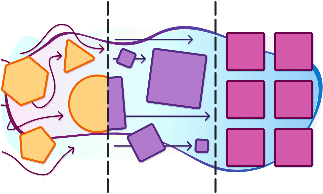
If we leave the really hardcore customization out for now, we’re left with three main levels of abstraction:
- The content layer — the information displayed on the site. This could be a folder full of Markdown, a headless CMS, or some kind of dashboard or database. No code is required at this layer.
- Presentation — this is a theme that defines markup and styles for presentational components. This layer is only concerned with the UI; it doesn’t care where data comes from.
- Data orchestration — this theme executes queries and provides the data to components as props. This layer is what actually connects to the source of content, whether that’s the filesystem, a database, or a third-party API.
How to set up abstraction layers in Gatsby themes
As theme authors, we can choose the level of abstraction each theme addresses. Later in this post we’ll look at real site using a Gatsby theme, but — in reality — our theme is actually two themes:
- a parent theme to handle the data layer
- a child theme to handle the presentation layer
There’s a reason for this, and it’s among the more exciting parts of Gatsby themes in my mind: by abstracting data management, we can define a schema for data — and then stop worrying about where the data comes from.
In practical terms, this means — assuming the abstractions are done properly — a Gatsby theme for managing Post data can be created as a schema contract, and dozens (or hundreds, or thousands) of presentation-layer themes can be built against that schema contract: they know that a Post has a title and content, so they confidently grab that data and style it.
But then — and here’s where this gets really exciting — any data source can be adapted into the Post format. In this example we’re mapping MarkdownRemark nodes to the Post type, but there’s nothing stopping us from also mapping data from a headless CMS, JSON, or literally any other data type to the Post type.
This is huge, because it means that we have the potential to create a shared pool of themes that work for any data source. To the best of my knowledge, this has never been possible before; if you like a Woocommerce WordPress theme but want to use Shopify, you’d need a developer to port the WordPress theme into a Shopify theme.
With data abstraction in Gatsby themes, the base theme would query against a Product type, and product data from WordPress and product data from Shopify would be mapped to the Product schema.
This means that the same theme that worked for WordPress will work for Shopify with zero code changes.
To put these abstractions in context, let’s build a blog using a Gatsby theme, look at the layers of abstraction, then opt out of them to customize our app.
Build a site using Gatsby themes
To start, let’s create a site using a Gatsby theme that requires almost no code or configuration.
Step 1: create a folder for the site
To start, create a new directory and move into it. This will be our blog site.
# Create the site folder and move into it.mkdir data-abstraction-example-sitecd data-abstraction-example-site/Step 2: add a package.json
Next, create a package.json:
# Create a package.json with the default settings.npm init -yStep 3: install dependencies
To use a Gatsby theme, we need to install Gatsby, React, React DOM, and the theme itself:
npm install gatsby react react-dom @jlengstorf/gatsby-theme-styleStep 4: tell Gatsby to use the theme
As our final code step, let’s tell Gatsby to use the theme by creating a gatsby-config.js:
module.exports = { __experimentalThemes: ['@jlengstorf/gatsby-theme-style'],};Step 5: add a post
Next, we can add content. Create a folder called content/posts/, then add a new file called foo.md with the following content:
---title: Super Sweet Postdate: 2019-02-28author: Jason Lengstorf---
This is blog content!
[Gatsby themes](https://www.gatsbyjs.org/blog/2019-03-11-gatsby-themes-roadmap/) are cool.
Step 6: start the site
Once this is set up, we can start the app and see our post:
gatsby develop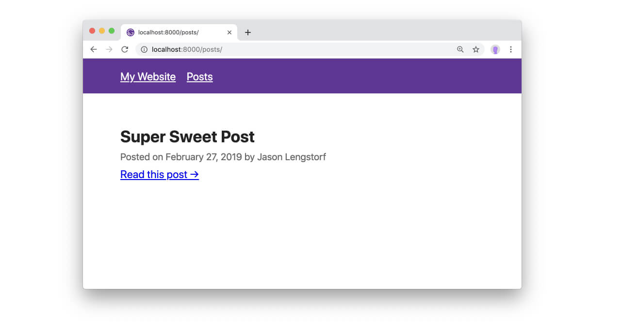
Once the server starts, we can open http://localhost:8000/posts/ to see the content we created.
What makes Gatsby themes different?
With almost no code, we’ve created a complete blog from scratch. On its own, this is exciting, but not groundbreaking. Pretty much every website builder out there has themes in one form or another.
So what’s so special about Gatsby themes?
What sets Gatsby themes apart from other theming systems is the ability to selectively opt out of parts of the abstraction. We can keep the convenience in all the places where the defaults suit our needs and make customizations where they don’t.
In short: Gatsby themes don’t force us to choose between convenience and control.
To understand the power of Gatsby themes, we need to start evolving our site and outgrowing the default settings.
Selectively opting out of abstractions
As our site grows, we may decide that we want more control over the layout. Perhaps we want to add a link to our Twitter to the end of each post.
To do this, we take advantage of component shadowing. This is a technique that allows us to selectively replace parts of the theme without needing to eject the entire theme.
Gatsby handles component shadowing by looking in a site’s src directory for a folder named after the theme being used, then looking for paths that match the theme’s structure.
For example, if the theme is called gatsby-theme-foo and it has a file located at src/components/bar.js:
.└── gatsby-theme-foo └── src └── components └── bar.jsThen we can shadow this component by creating a new file in our site here:
.└── gatsby-theme-foo└── src└── gatsby-theme-foo└── components└── bar.jsTo shadow our <Post> component, we need to create a new file in our site at src/@jlengstorf/gatsby-theme-data/components/post.js and add the following:
import React from 'react';
const Post = ({ title, content, author, date }) => (  <React.Fragment>    <h1 className="post-heading">{title}</h1>    <p className="post-byline">      Posted on{' '}      <time dateTime={new Date(date).toISOString()}>        {new Date(date).toLocaleDateString('en-US', {          year: 'numeric',          month: 'long',          day: 'numeric',        })}      </time>{' '}      by {author.name}    </p>    <div      className="post-content"      dangerouslySetInnerHTML={{ __html: content }}    />    // highlight-start    <p>      For more content like this, you should{' '}      <a href="https://twitter.com/jlengstorf">follow me on Twitter</a>.    </p>    // highlight-end  </React.Fragment>);
export default Post;
After saving the new component, stop the site (control + C), then start it again:
gatsby develop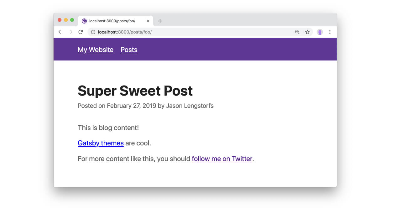
The post now shows a link to Twitter at the bottom.
We can go much deeper
It’s also possible to modify the underlying data, add new components, or even compose themes together (e.g. a blog theme and an ecommerce theme). We won’t get into that in this post, but the potential of Gatsby themes is extremely high.
Further reading and resources
- Source code for the example site
- The data theme used in this example
- The presentation theme used in this example
- Posts about Gatsby themes on the Gatsby blog
- A deeper exploration of progressive disclosure of complexity