Design a Flexible Social Card Template for Sharing Content
Creating eye-catching social sharing images doesn’t have to take a ton of time. In this post, learn how to create a reusable template for sharing your posts.
When sharing content on Twitter, Facebook, and other social media platforms, adding an eye-catching image is critical to making sure your content doesn’t get lost in the timeline. In this post, we’ll look at a strategy for designing a flexible, reusable template for sharing posts that helps brand your content without requiring you to create a bespoke image for each post.
Define a template for social media sharing images
In order to create a reusable template for our social sharing images, we need to create a template that will work for any post we create.
For our template, we want to include:
- Our logo (or photo) — showing our brand helps associate us with our content.
- Post title — this should be limited by the length that Google will show in search results. We can use an SEO snippet generator to check the length of our post titles.
- Tagline — this can be any additional text we want to show on the sharing image. In this example, we’ll use the post tags.
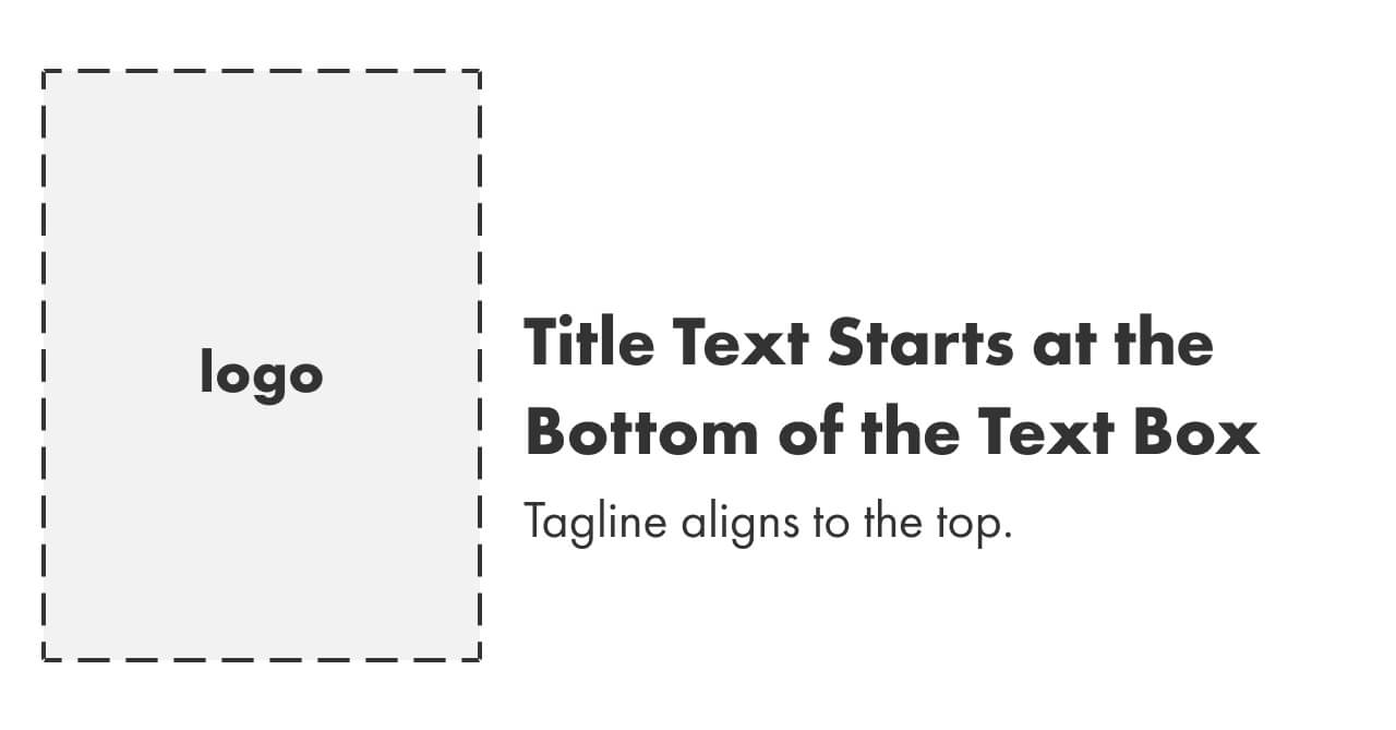
Our template will put the branding on the left, with the title and tagline on the right, like this:
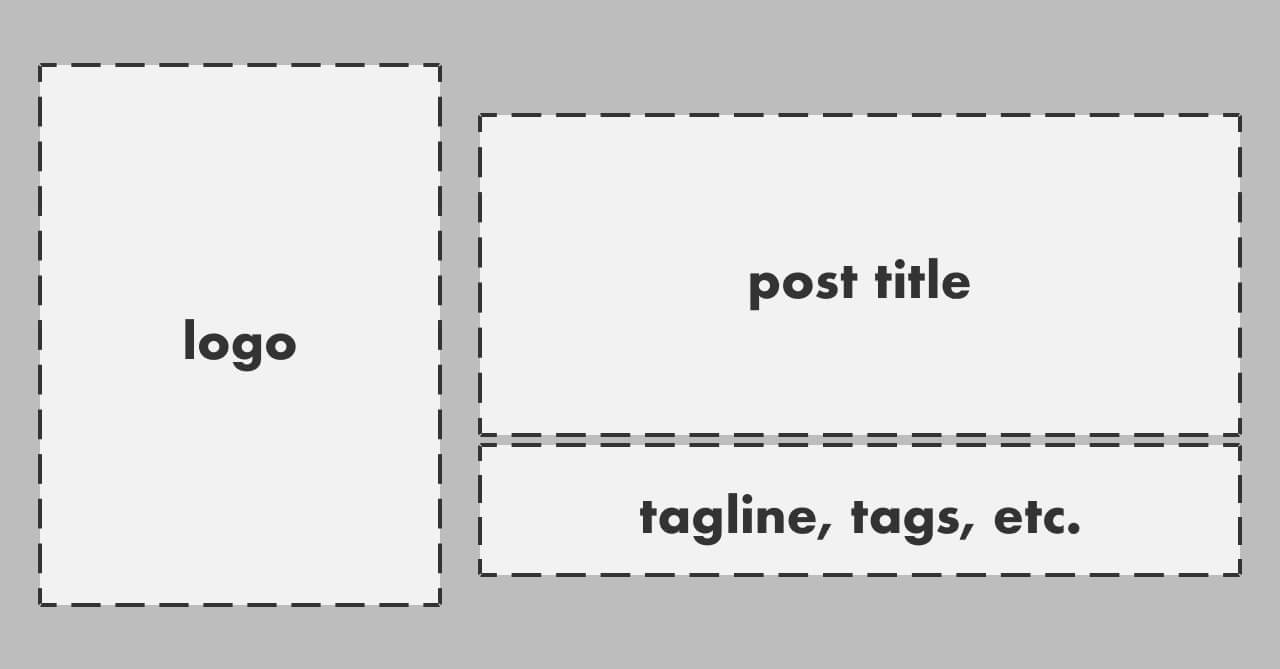
This means that we need two text overlays — and it needs to look good with any length of title and tagline.
Position the heading on the image
Let’s start by getting the heading in the right place on our image.
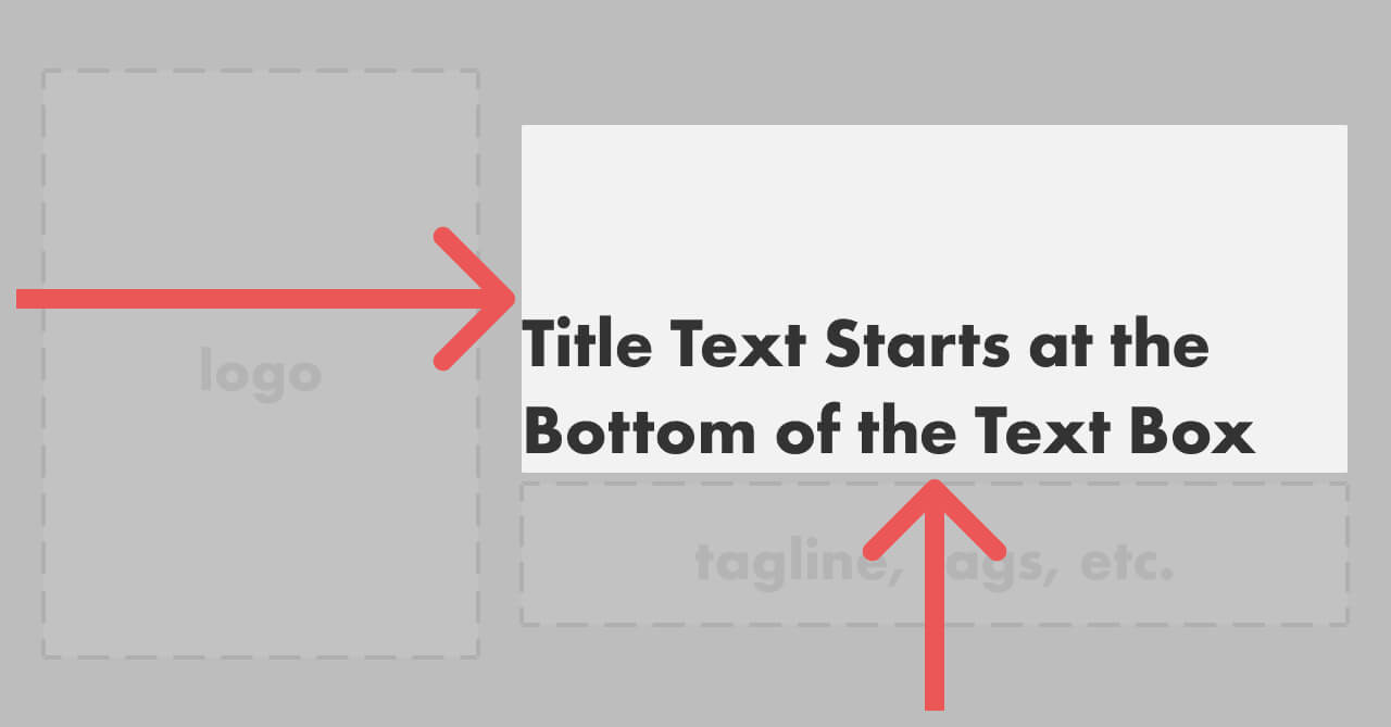
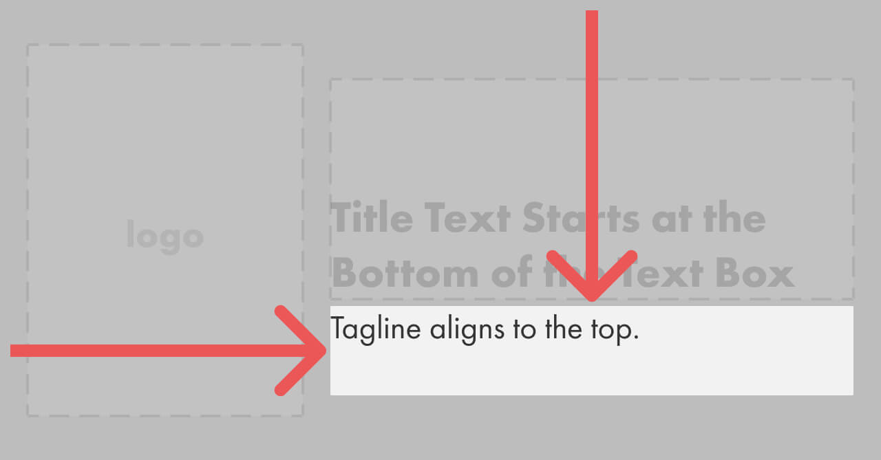
Because the title needs to be near the tagline no matter what the length of either, we want the title to always be positioned at the bottom of its available area. We’ll do this using the gravity transform, setting it to south (for “bottom”) and west (for left).
Cloudinary does alignment using directions (i.e. north, south, west, east) instead of calling it top, bottom, left, right — this can be a little confusing the first time you use it if you’re not ready for it.
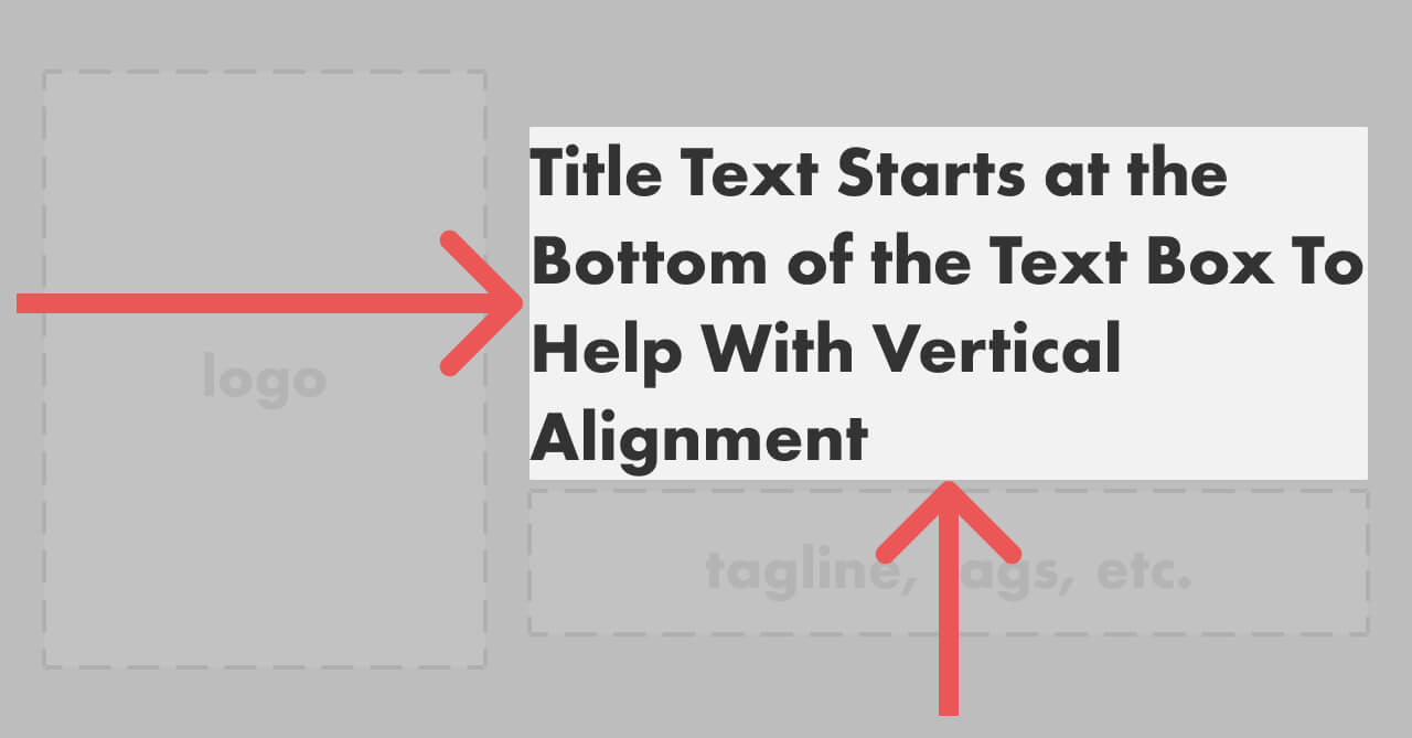
This means that the title will still align well with the tagline, even when the title is short:
Next, we’ll set up the tagline.
Position the tagline on the image
The tagline should be near the title no matter its length, so we’ll use north (for “top”) and west (for “left”) as the gravity settings.
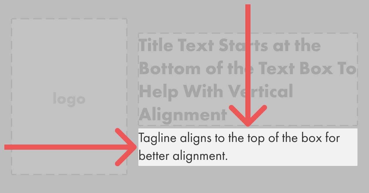
This means that even short titles and taglines still look right in the image:
With this setup, we can use any combination of title and tagline that fits within their respective areas and it’ll appear properly aligned on the card.
The image template can be anything as long as it leaves the text area clear
Now that we have our text overlays positioned, our sharing image can look any way we want — the only requirement is that the text areas stay clear and have enough contrast to be legible.
The simplest possible image might just be a white background with our logo:
For my site, adding the logo looks like this:
![]()
This already looks pretty good! However, I wanted to add a little something extra to make it look more branded, so I put in top and bottom borders and a subtle background pattern, which ended up here:
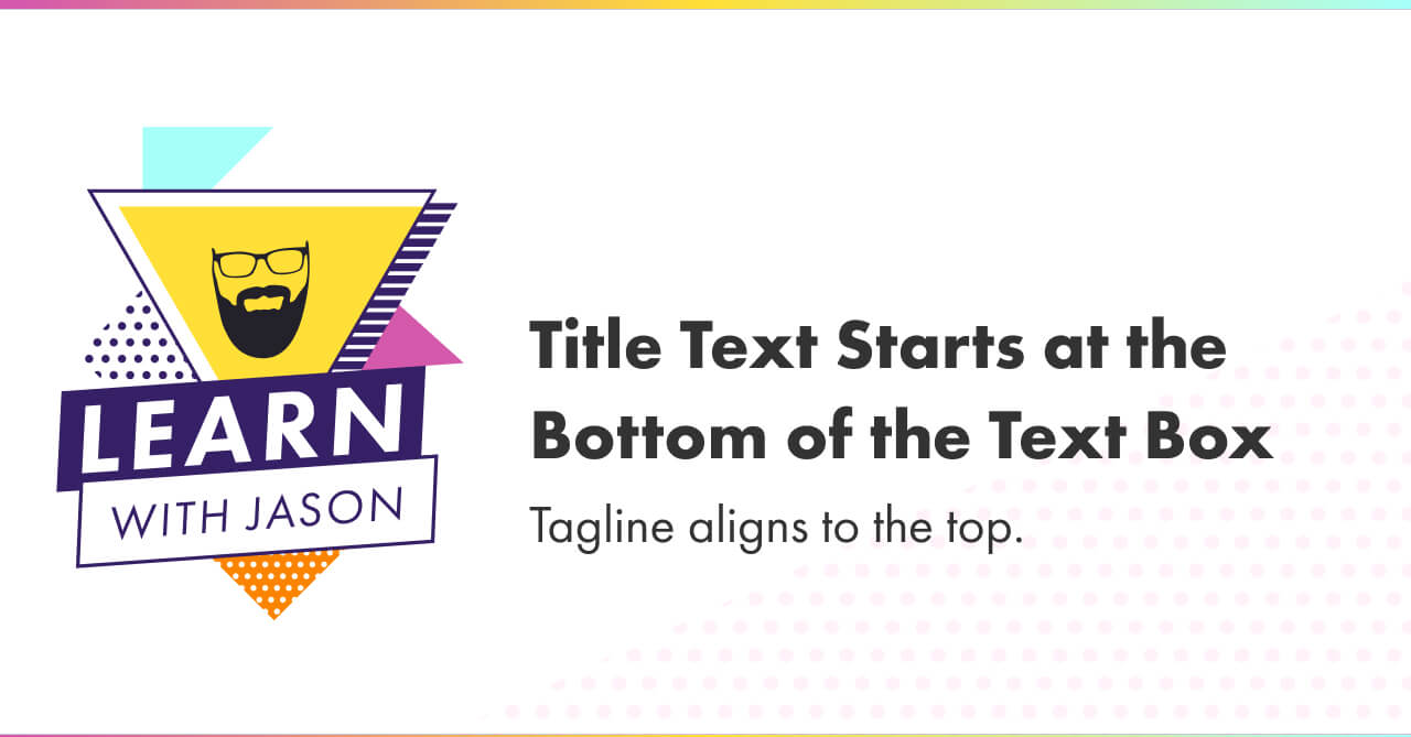
A longer title and tagline still looks right in this template:
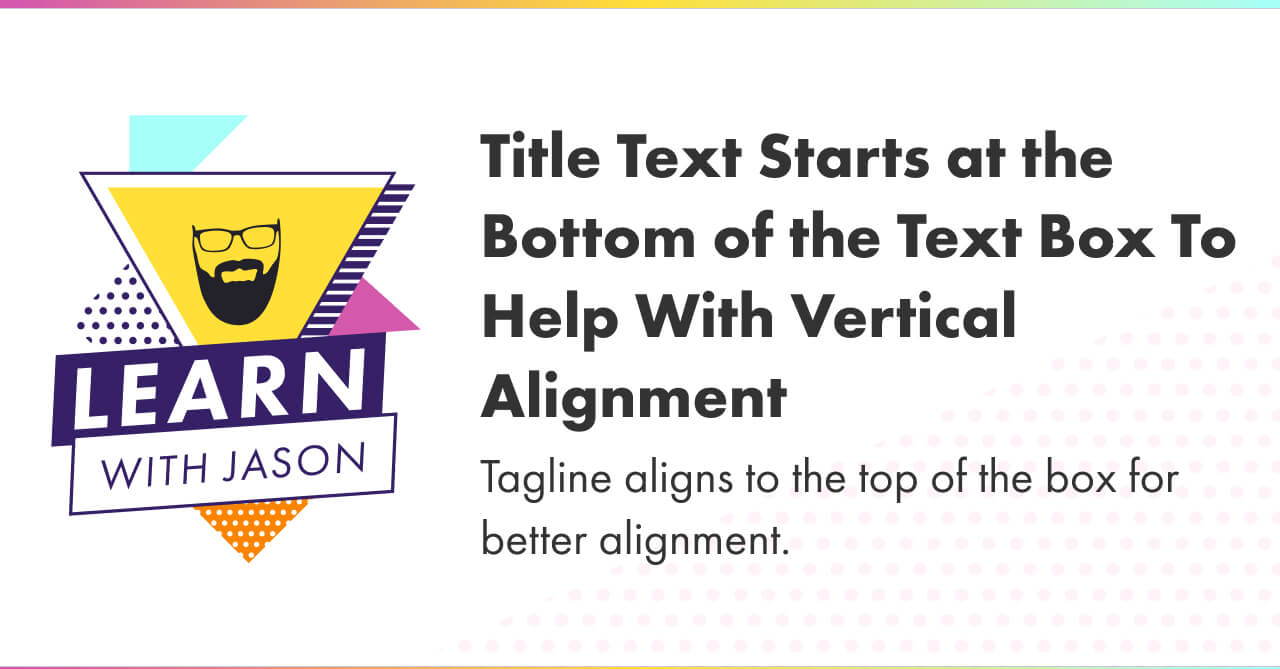
This looks pretty good, if I do say so myself. 😎
What to do next
- Use the Figma template to design your own social sharing card
- Use Cloudinary to automatically generate your social sharing cards